MLB Historic Moments AR Case Study
Timeline
January 2023 - March 2023 (12 weeks)
My Role
Solo client project for NYU Tandon School of Engineering UX Design for AR/VR certificate program
PROBLEM
Target user needs a fun way to engage with MLB history to share the love of the game with their kids
We were given a creative brief from Major League Baseball (MLB) asking “What is the ultimate fan experience at the ballpark?” We were also given a persona for their target user, an early adopter dad. This led to the problem statement of “MB is an early adopter dad who needs a fun way to engage with MLB history because he wants to share the love of his game with his kids.”
This touched on our client provided persona’s needs of addressing game downtime and family bonding, as well as a secondary persona of an MLB interactive director needing to increase young fandom and viewership as well as utilize emerging technologies.
We were also asked to note COVID-era considerations, how it has changed how people engage and watch the game.
THE SOLUTION
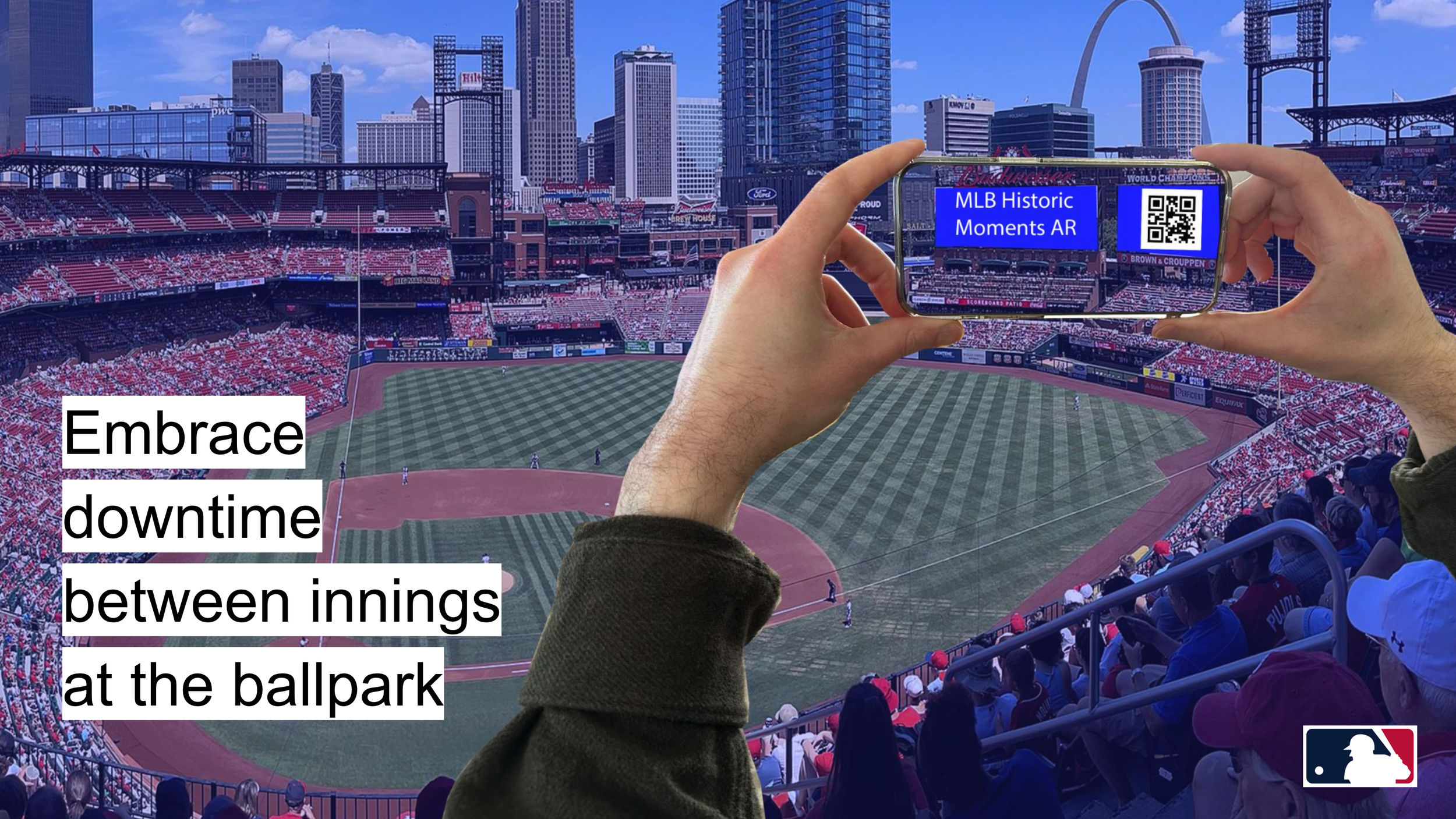
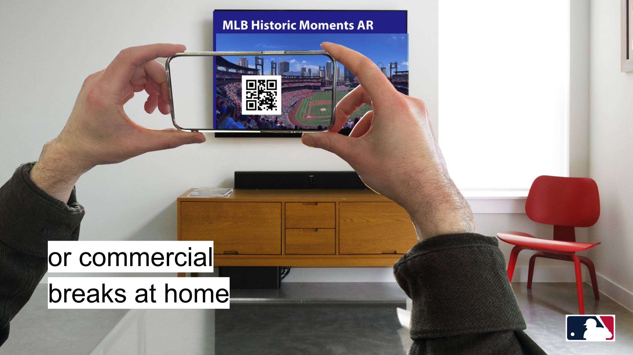
A seek and find AR app experience connecting users to MLB history at the stadium or at home
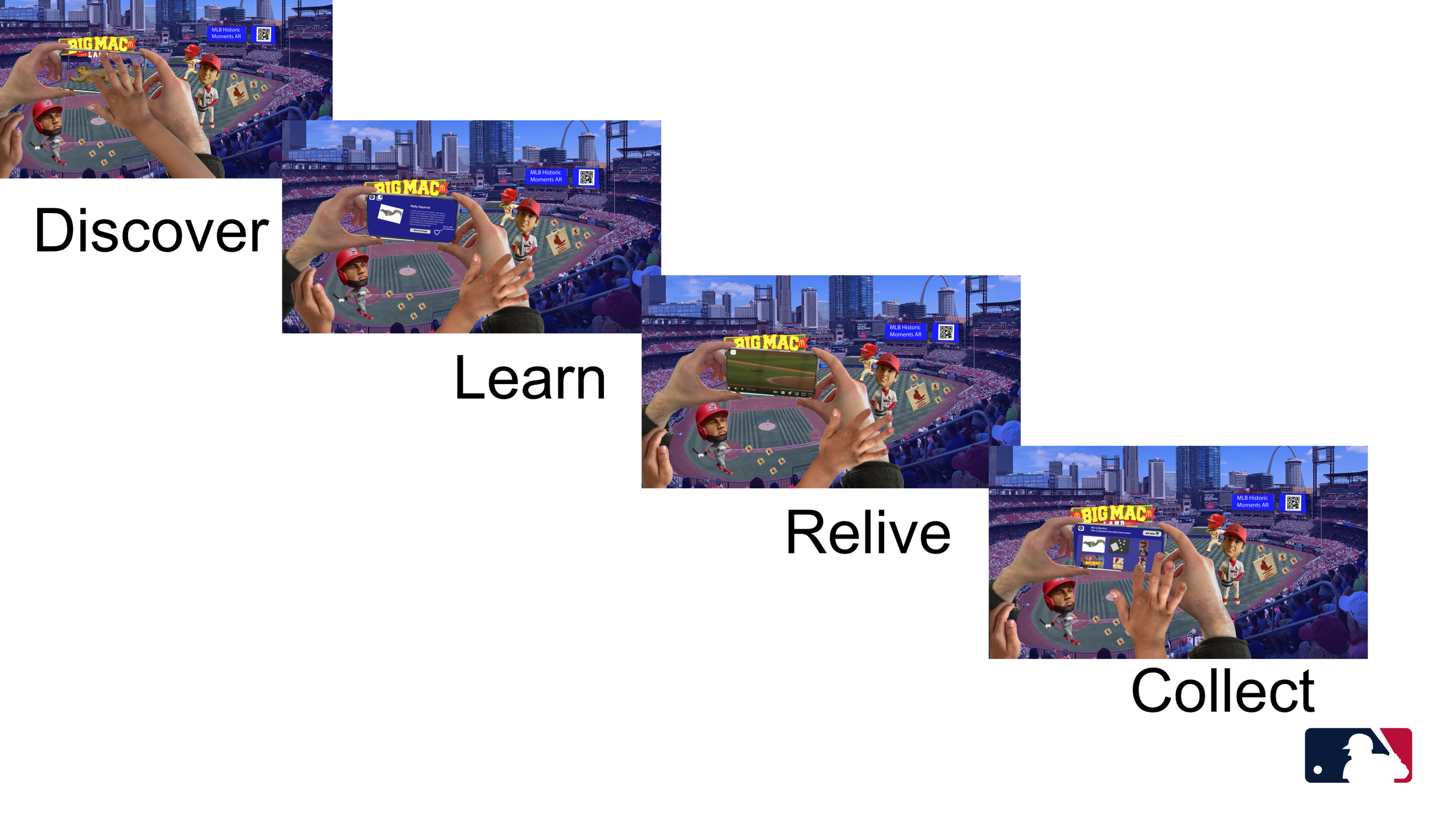
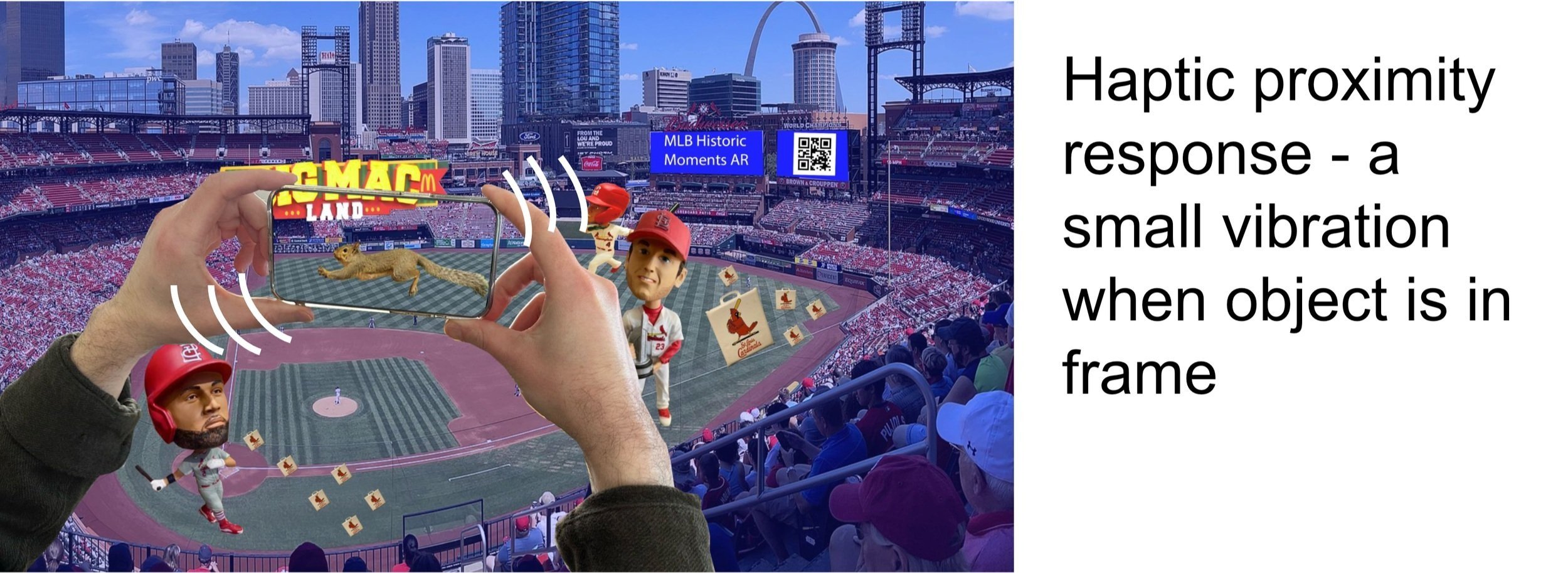
Tappable 3D objects appear around the field each representing a fun and historical moment. The project seeks to engage target users during downtime in the game while also increasing MLB’s younger fanbase, connecting users to MLB history whether they’re at the stadium or at home.
Tapping an object takes the user to an info screen that let’s the user learn about that object/moment through reading or watching historic footage. There is also an option to save the moment to an archive of their collected favorites.
RESEARCH
Emerging tech + storytelling
Research included deep dives into recent MLB technological advancements in edge computing, as well as sensor data streams from chips on players uniforms and their stats cast system. I dove deep into AR experiences from competitors, other sports and entertainment. I also looked at the different styles of storytelling used as well as trends in sports viewership during COVID.
COMPETITIVE ANALYSIS + OPPORTUNITY SPACE
Lack of explorative + educational sports experiences
I analyzed different innovative experiences, their strengths and weaknesses and noting what types of technological innovations were being used. Some experiences like ARround stadium explored social AR but as minigames that didn’t connect you deeper to the game. Others focused solely on the innovation of immersive live analytics like Fifa’s World Cup 2022 Stadium experience. The Famous group did a great Jackie Robinson tribute as a live broadcast mixed reality experience, but it wasn’t interactive or explorative. Explorative + educational was a good opportunity space.
USER INTERVIEWS
Qualitative research
3 in depth exploratory user interviews
Sample questions:
Walk me through what a day of going to the stadium is like?
What are your favorite parts of going to a game at the stadium?
What frustrations do you have experiencing a game at the stadium? What do you feel could be improved?
What are your favorite parts of going to a stadium game with a younger family member?
What are your Frustrations? What could be improved?
What sorts of phone activities do you allow younger family members to play on your phone ?
Walk me through your experience of watching a game remotely
THE MAIN INSIGHT
Wanting to feel engaged during game downtime
All the users interviewed expressed wanting to feel more engaged during game downtime. They also reminisced with physical detail favorite plays or moments of fandom and underscored the importance of experiencing the game together.
PERSONAS
I created a primary and secondary persona board. The client given one can’t be shown, but below is a persona of a MLB Technology Director.
Miro board link here.
DESIGN
Shifting from immersive analytics to object-based storytelling
Initially design direction explored creating historic replays with clickable player beacons and immersive analytics like MLB at Bat and FIFA+ Worldcup 2022. It would include historic plays replaying on the field in AR with a focus on stats and historic broadcast coverage.
However, during interviews users would get lost in not just talking only about the historic play as it unfolded, but would often zoom in on specific physical details of the memory, moving beyond the stats to focus on the stories that connect us to a team. This also inspired the idea for an experience that could be a catalyst for generational storytelling, something that could spark conversation, sharing the love of the game with one generation to the next.
AR Objects were selected from memories shared during user interviews.
TESTING + IMPROVEMENTS
QR Code was a successful app entry strategy
“Ooo! Scan QR on the screen with my phone, that’s something I do a lot to sign into things, so that’s easy”
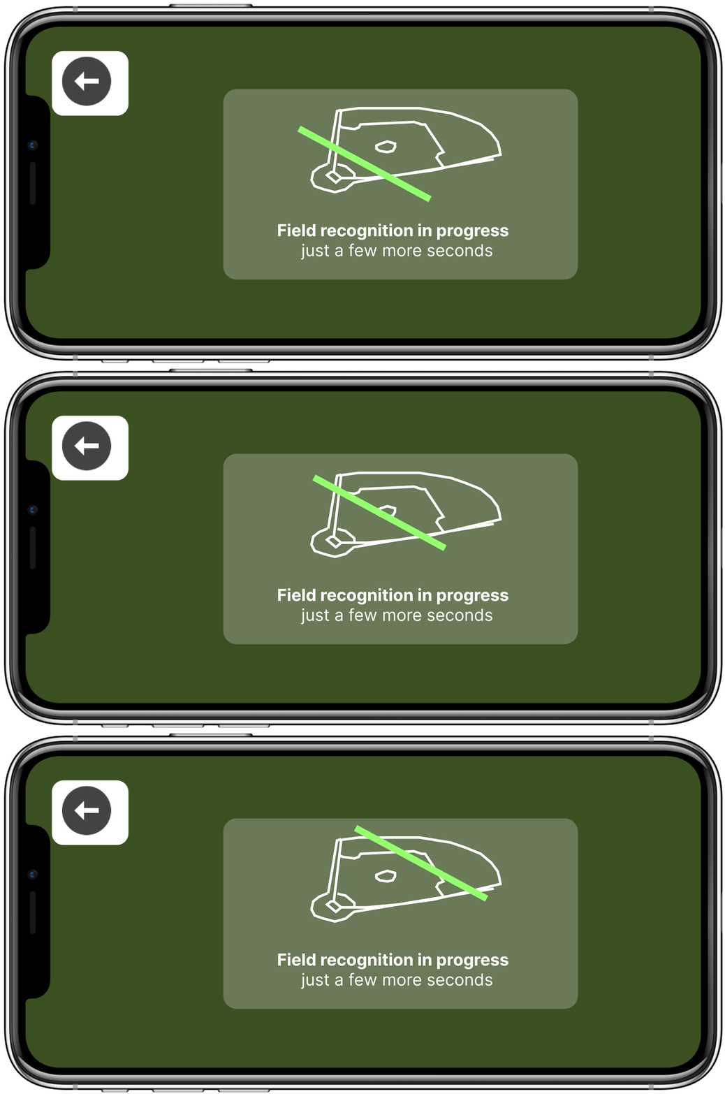
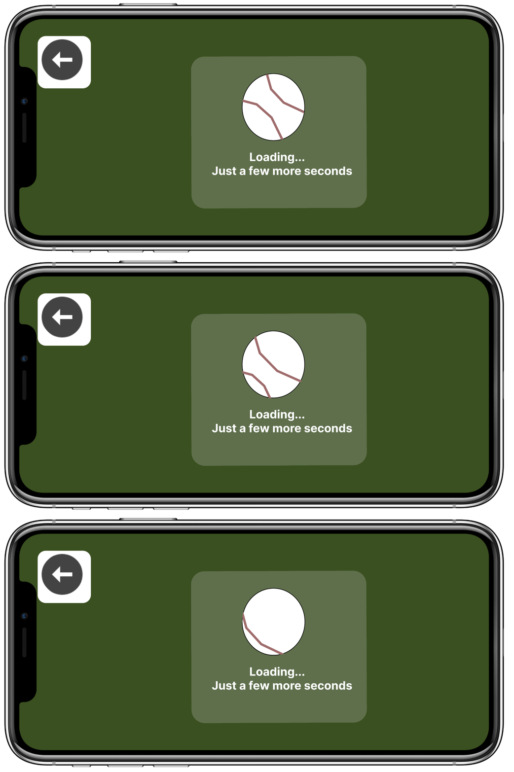
Adding motion to AR loading screen UIs
During 1st round of testing, users wanted visual feedback to know that a screen wasn’t frozen. Above are UI mockups used for 2nd round of testing. All users really appreciated the visual feedback, and especially enjoyed the rotating baseball.
Exploring XR accessibility features
Accessibility is important for every experience. Having the ability to disable motion and incorporate low vision/ audio description settings was inspired by the article “Designing for Accessibility & Inclusion” describing different lenses of accessibility. There’s also a Spanish language option at launch to tailor to the personas.
THE FINAL INTERACTIONS
The final product
CONCLUSION + LESSONS LEARNED
Future product steps
Usertesting with kids and their guardians
Digging deeper into different types of historic moments, fandom and lore
Explore fun UI decisions & aesthetics around the seek & find experience theme
Ideate around unlocked rewards that would further enhance the game day experience — ex: a coupon for a food stand or discounted merch? A badge system?
Add more objects
What I’d do differently next time
Testing with kids earlier
Launch a survey to get a larger range of feedback from users
Begin with multimodality - As a point of future inspiration, in the paper “Making Mobile Augmented Reality Applications Accessible” they mention, “with AR and other emerging technologies, we have the opportunity to consider accessibility and multi-modal interactions from the beginning of the design process, rather than as an afterthought”. This project was initially developed as a visually driven experience. How would the project have evolved if was designed for multimodality from the very beginning? I think it’s important to begin with multimodality first to lead to more inclusive experiences.


